Background
Overview
During my time at Legrand, I had the privilege of spearheading a transformative initiative aimed at enhancing our design system. This multifaceted project was driven by the need to update our design system to be easier to use for our designers and match accessibility guidelines.
The LNCA Design System was a cornerstone of our design process, providing a solid foundation for creating cohesive and visually appealing products. However, it faced several challenges that necessitated a comprehensive overhaul:
- Color accessibility,
- Tool migration from Sketch to Figma, and
- Outdated SharePoint documentation.
⌚ Timeframe
2022 to 2023
6 months
6 months
🗣️ Team
1 designer: me
2 front-end developers
2 front-end developers
📦 Deliverables
Figma components
Updated documentation
Updated documentation
What we did
Problems to solve
Color accessibility
I embarked on an extensive review of our color palette, ensuring that it met the highest standards of accessibility. This included refining color combinations, contrast ratios, and guidelines for usage.
Migrating to Figma
As our team of designers were all switching over from Sketch to Figma, the design system needed to be set up to accommodate for the migration. I transferred design components, templates, and assets to Figma. This shift not only improved collaboration but also positioned us to take full advantage of Figma's innovative features, including the updated component properties.
SharePoint site overhaul
After doing an audit of the outdated documentation on our SharePoint site, I updated those pages and ensured that documentation was created or updated properly for each future change.
My role
- Primary point of contact for the LNCA design system.
- Created components in Figma for designers.
- Audited our design system for accessibility and made accessibility enhancements.
- Documented outdated and new Figma components in SharePoint.
- Advocated for the LNCA design system with the broader global Legrand team.
Results
Figma components
Linked below are all the Figma components that were created during this effort. I began by prioritizing the most commonly used components and working backwards from there. Each component is streamlined with properties, and visual accessibility ratings are clearly called out. Some simple usage guidelines are also noted within this file.
 Figma components
Implemented in designs
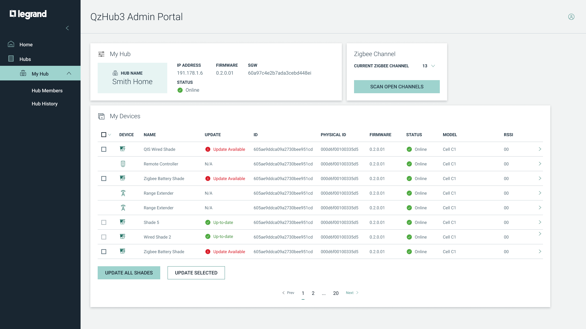
The Figma components are now being fully used by the LNCA design team to create new designs.

Outcomes
Enhanced accessibility
The revamped color palette and accessibility guidelines ensured that our designs were more inclusive and user-friendly, aligning with Legrand's commitment to diversity and inclusion.
Streamlined collaboration
The transition to Figma facilitated smoother collaboration among designers, improved version control, and accelerated our design iterations.
Up-to-date components and documentation
Having all the components live on the Figma web meant that it became incredibly accessible, and every update to the component was easily implemented within designs. The dynamic SharePoint site also became a reliable source of truth for designers, offering instant access to the latest design components and guidelines, ultimately enhancing design productivity.
.png)
.jpg)
